
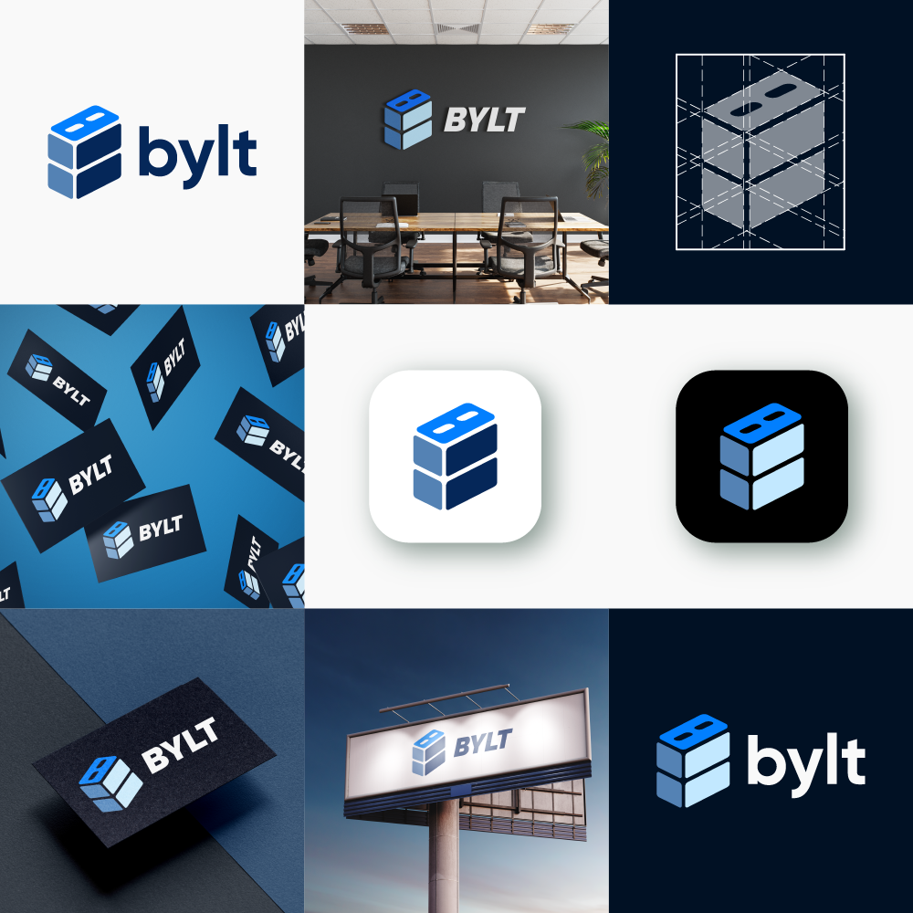
BYLT
I had the opportunity to design the brand logo for Bylt, an AI-powered construction app focused on simplifying the project-sharing experience between contractors and homeowners. The goal was to create a clean, modern, and startup-friendly logo that reflects trust, innovation, and structure.
The final design combines strong typography with a custom icon that subtly forms the letter “B” while representing building elements like structure, layers, or a cube. I delivered multiple variations, including light, dark, and black & white versions, along with source files and branding assets for web and print use.
This project reflects my approach to strategic brand design — simple, meaningful, and versatile.
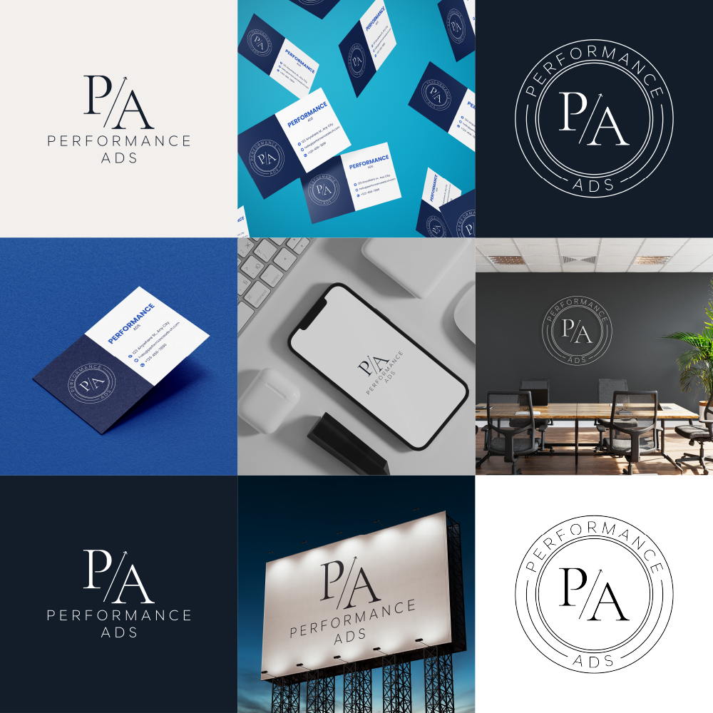
PERFORMANCE ADS
This logo design project was created for Performance Ads, a digital marketing agency focused on customer acquisition through social media. The client wanted a clean, modern, and minimal logo with a professional look, inspired by their original concept. I refined the logo by improving symmetry, adjusting typography, and creating a visually balanced design. To enhance brand recognition, I also created a logo animation based on the client's idea—featuring a dynamic line rising between the "P" and "A" to symbolize growth, with the letters emerging smoothly from the center. The final delivery included multiple logo variations, an emblem version for profile icons, and animated files for video intros and branding use.
MISSED UNDERSTOOD
Bold, modern, and a little playful—this logo for Missed Understood captures the podcast’s unique blend of honest conversations and clever perspectives. Designed to stand out and spark curiosity.
ZENITH
MAVIC 360
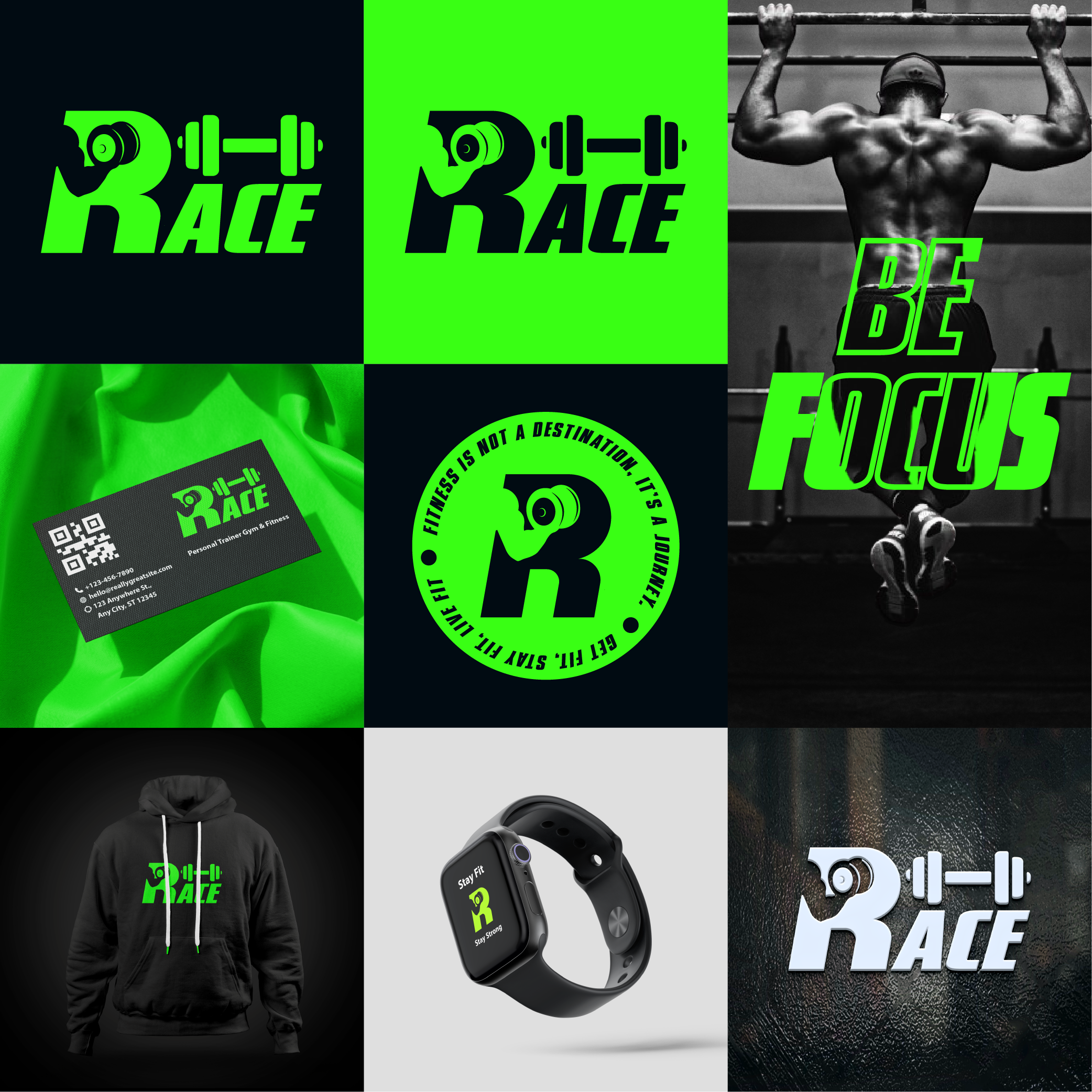
RACE
Introducing the dynamic logo for "Race," an innovative gym that embodies the spirit of speed and strength. The logo seamlessly merges fitness and velocity through a vibrant green color palette, symbolizing vitality and growth.
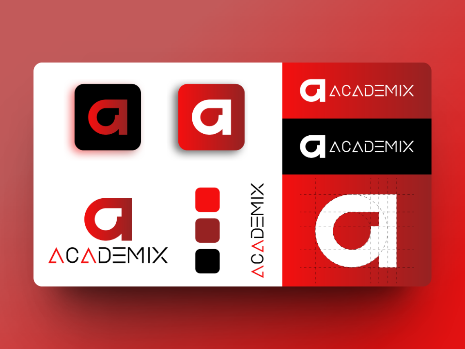
ACADEMIX
A standout logo I crafted for the prestigious education website 'Academix.' This emblem seamlessly blends scholarly elements with modern aesthetics, capturing the essence of learning in the digital age. The sleek, vibrant design is a testament to my ability to convey the spirit and purpose of a brand through visual storytelling. Explore this logo and more in my portfolio, and witness how I bring creativity and functionality together to create memorable brand identities.
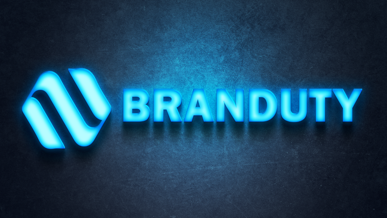
BRAND DUTY
Logo designing for "Branduty," an SEO agency, involves creating a distinctive visual identity that captures the essence of their services. The logo should convey the idea of branding and duty, showcasing a sense of responsibility and trustworthiness. A combination of modern, sleek design elements and classic typography can reflect their commitment to staying up-to-date with SEO trends while providing reliable service. Incorporating elements like a magnifying glass, a shield, or a stylized letter "B" can help symbolize their focus on search optimization and protection. The color palette should include shades that evoke professionalism, such as blues, grays, and greens, and may feature subtle gradients to suggest growth and improvement. Overall, a "Branduty" logo should represent a balance between cutting-edge SEO expertise and a steadfast dedication to clients' success.
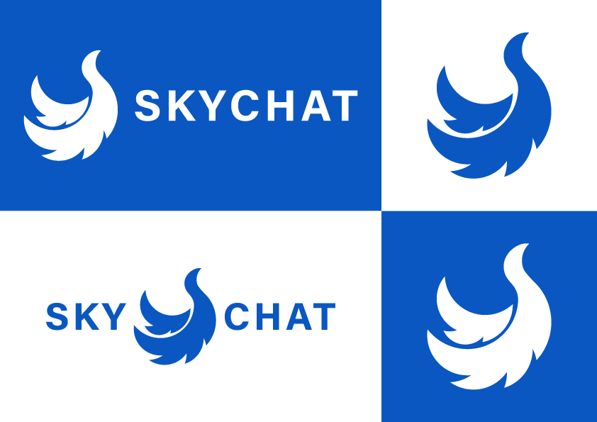
SKYCHAT
The logo for Sky Chat, a messaging app that aims to connect users seamlessly and elegantly, embodies the essence of communication and freedom. It features a sleek and modern design with a blend of blue and white hues, symbolizing clarity, trust, and tranquility.
PIXIE
The PIXIE logo encapsulates the essence of global connectivity through its innovative design and vibrant color scheme. Against a backdrop of a seamless blue-to-purple gradient, the lettermark takes center stage, boasting a custom font that exudes modernity and sophistication.
At the heart of the logo, the letter "X" stands as a symbolic representation of the interconnectedness between individuals. It serves as the conduit, linking people together in a digital realm of shared experiences and seamless communication. The deliberate shaping of the "X" reflects the fluidity and ease of connectivity that PIXIE offers.
Surrounding the "X," the letter "I" embodies the inclusive nature of PIXIE's reach, symbolizing people from diverse corners of the world. This letter signifies the global community that PIXIE serves, emphasizing its commitment to uniting individuals irrespective of geographical boundaries.
BISON
Bison specializes in offering meticulously renovated apartments at competitive prices. Catering primarily to married couples, our brand focuses on providing homes that exude comfort and affordability. We aim to convey a sense of enthusiasm and approachability in our services..
FOX MOTORS
The logo for "Fox Motors," a prominent golf cart manufacturing company, embodies a fusion of sophistication and dynamism. It features a sleek gear icon integrated with a stylized fox face, symbolizing precision, agility, and innovation within the realm of golf cart engineering.
MIST
HOME LAND
ROUND FALL PRODUCTIONS
Let's Get Started
Ready to start your Journey
Embark on a design journey with Saber Motion, where your ideas take shape and your brand reaches new heights. Contact us today to discuss your design needs and let us turn your vision into a visual masterpiece.